

reithof mileder
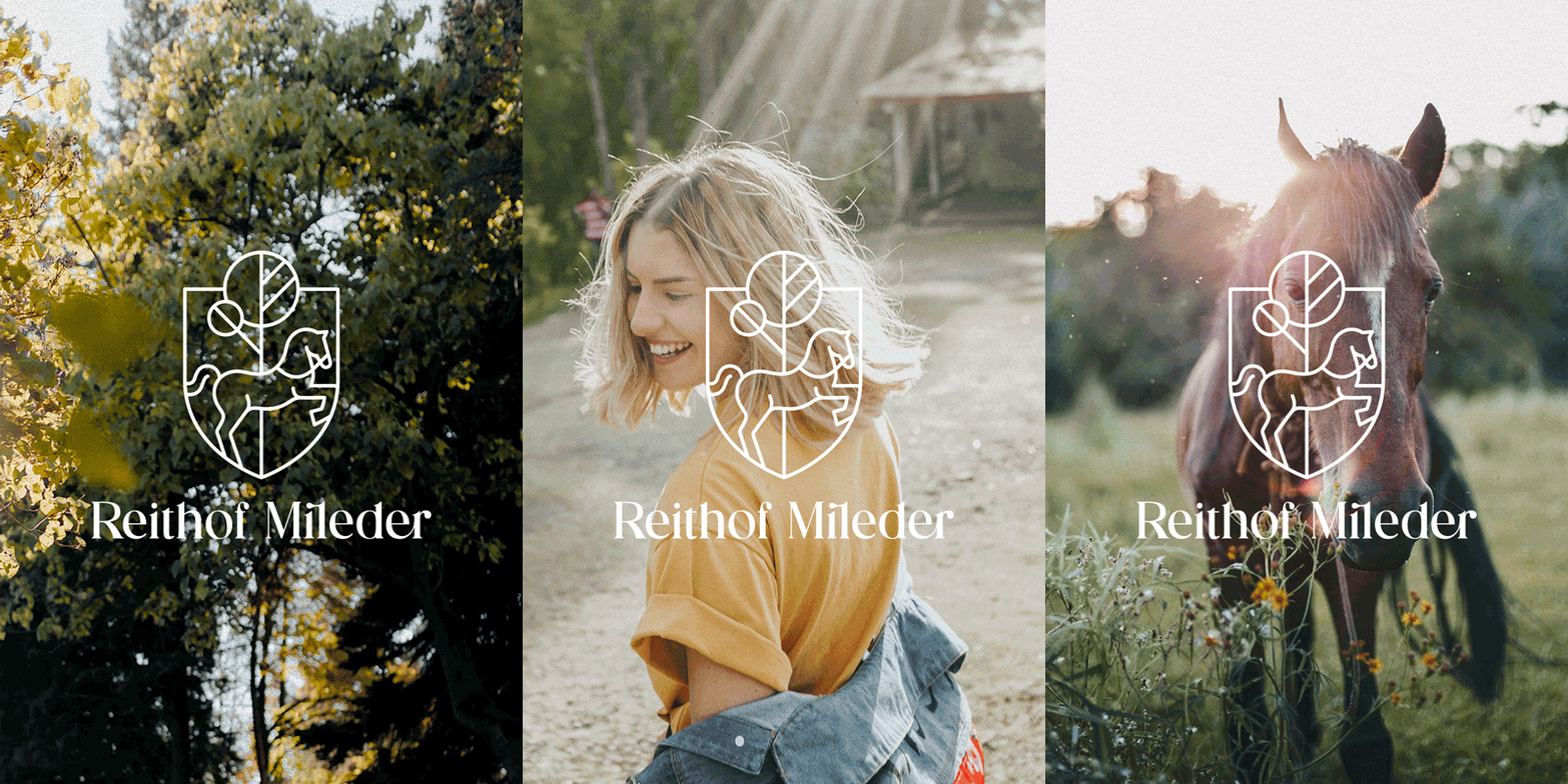
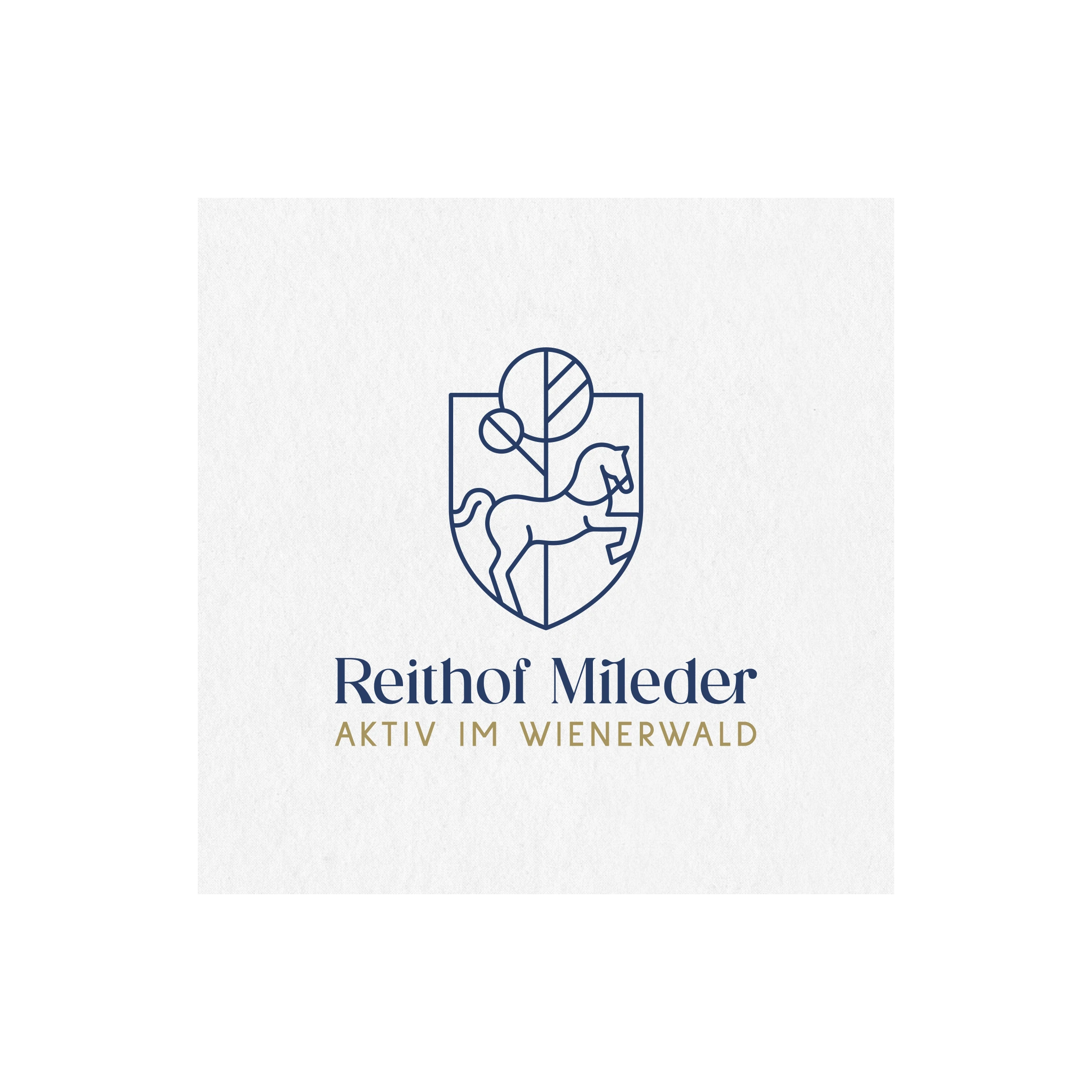
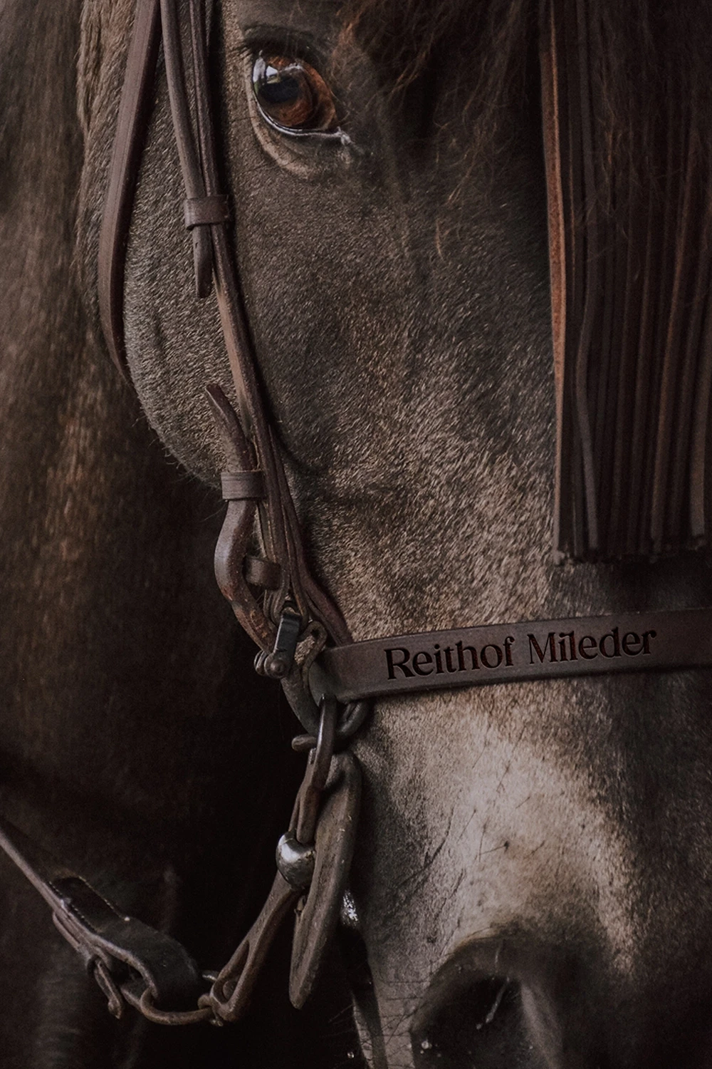
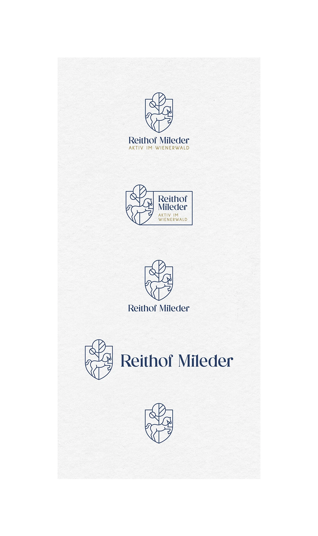
a family-owned horse riding yard in the heart of the beautiful wienerwald. the goal was to create a visual identity that reflects their core values. the logo design consists of a classic shape for tradition, a jumping horse for activity and their family tree to emphasize the love for nature. an elegant serif font and uniquely shaped letters express stability, but also fun. dark blue and gold convey trust and reliability. the unique brand identity gives reithof mileder a strong and recognizable presence.
photography: alan bajura, danielbonillao, giancescon
Date:
2022
