travellender
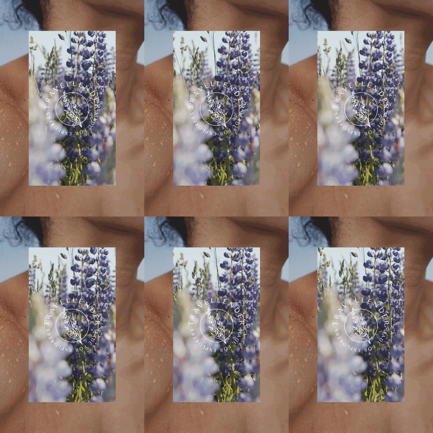
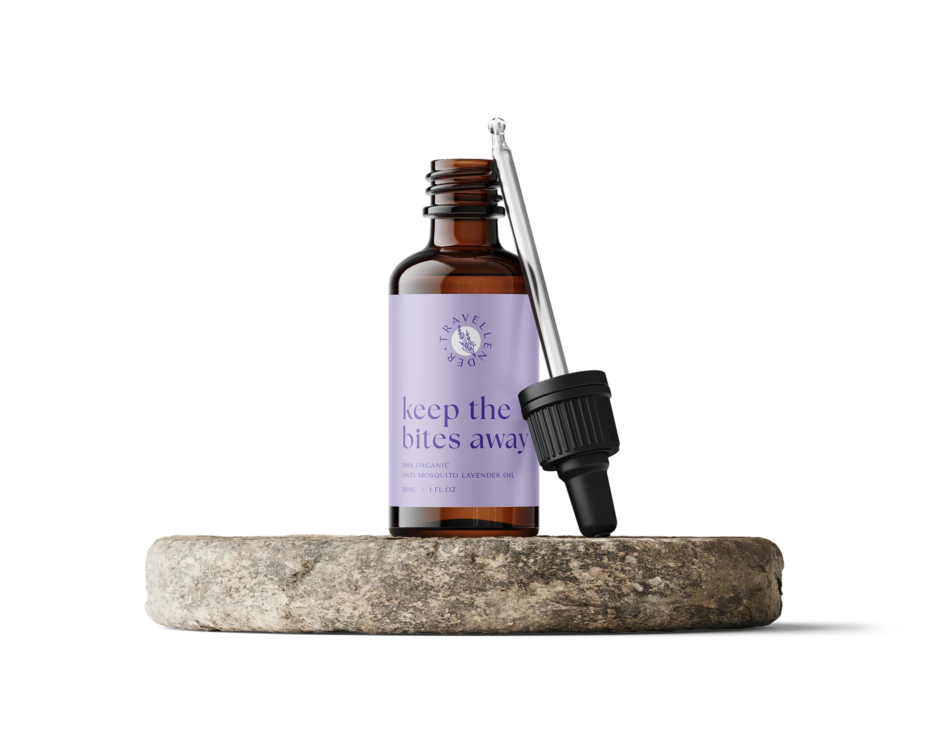
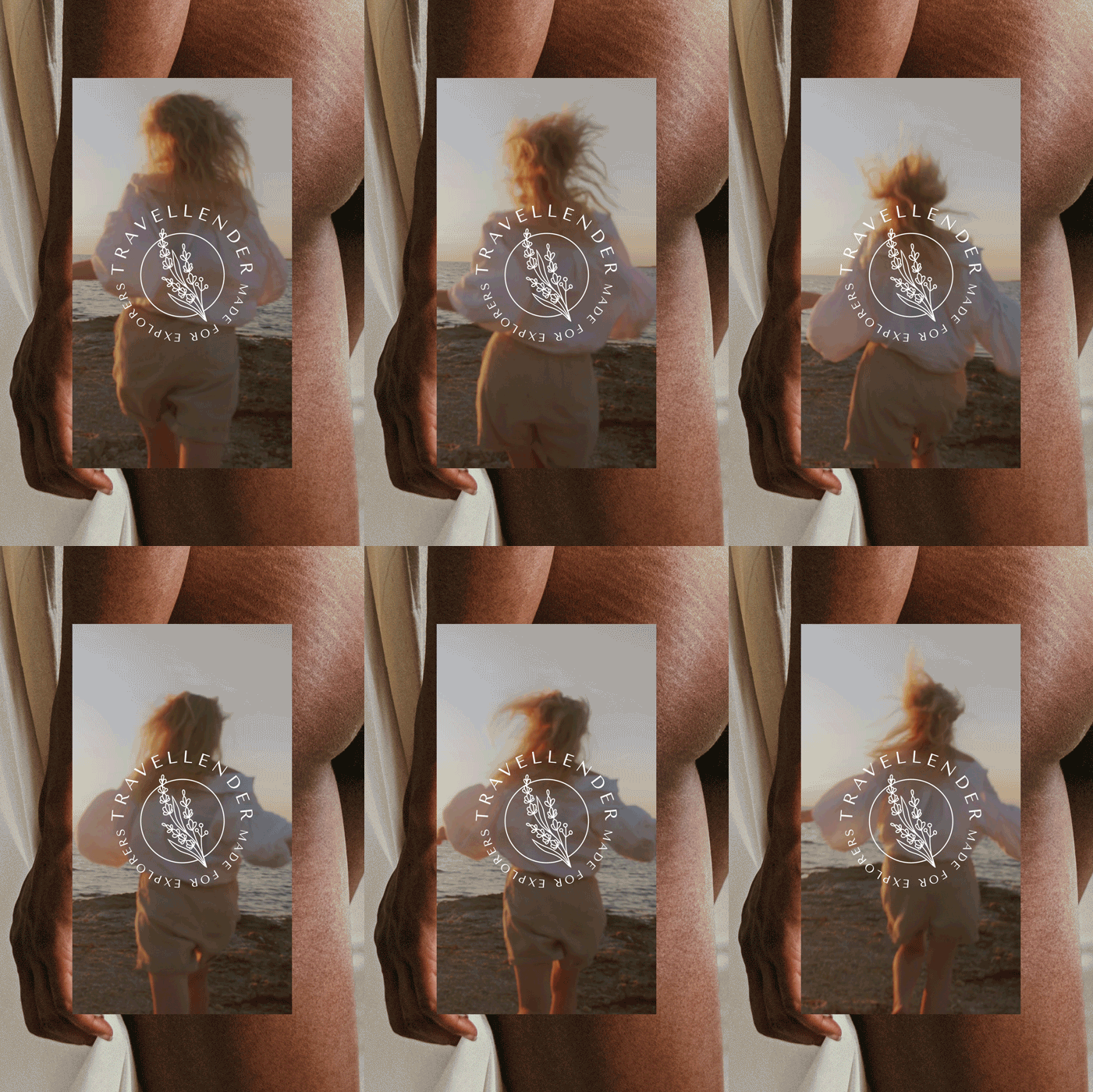
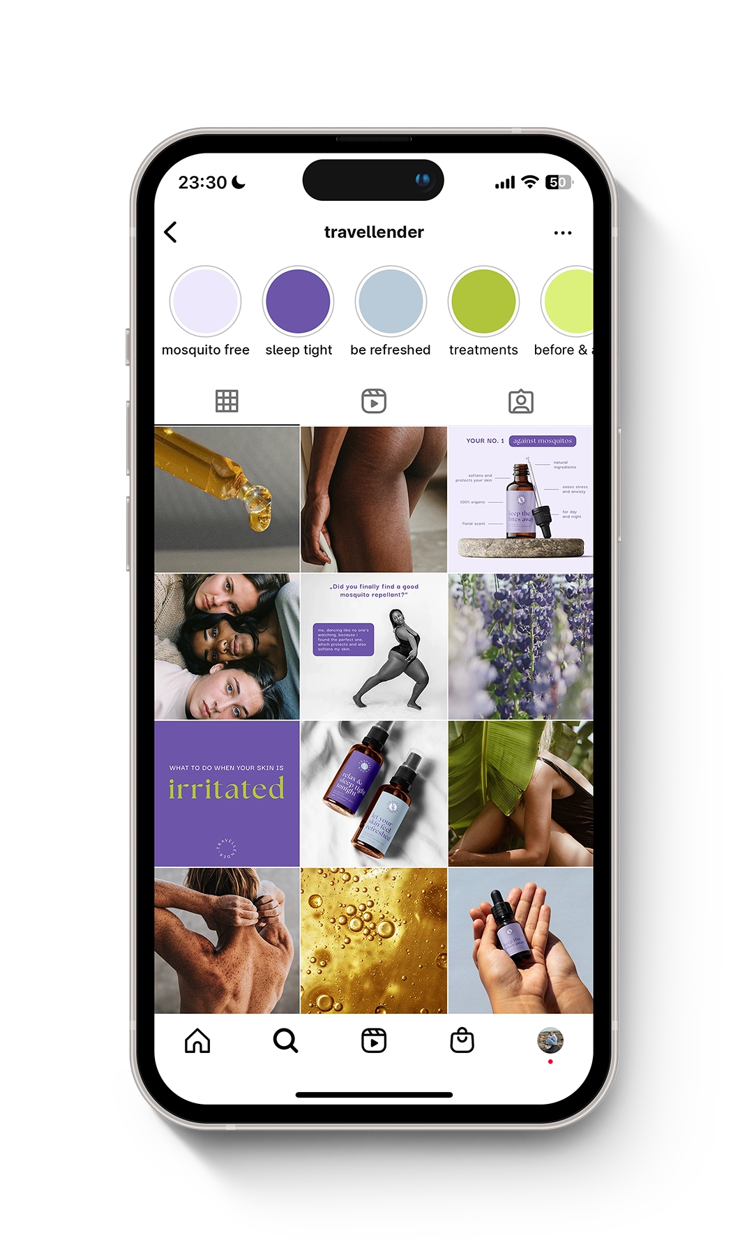
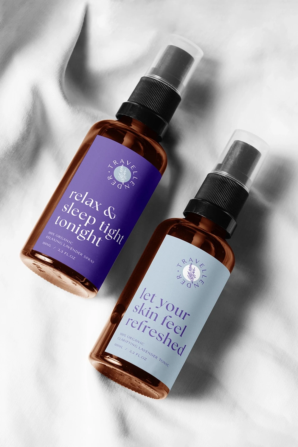
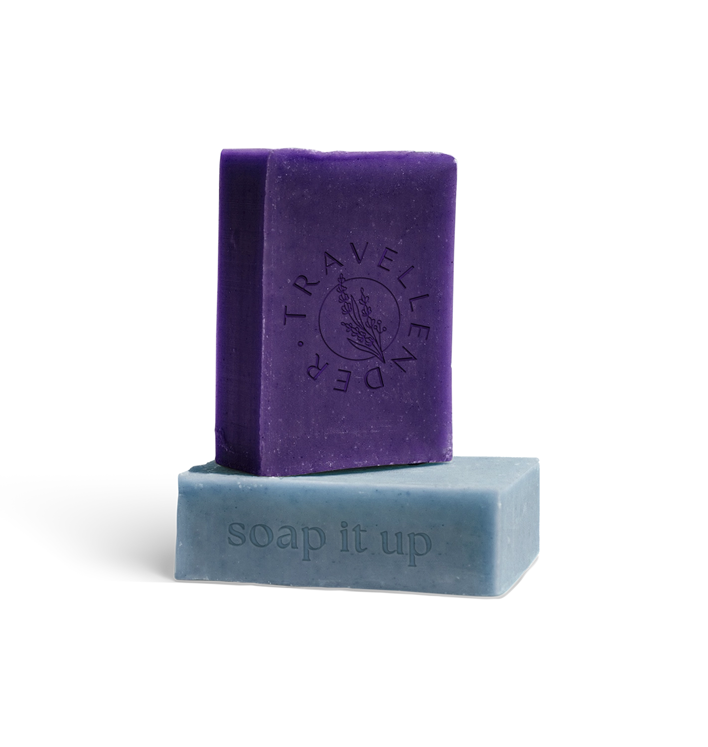
many years of travelling and thousands of mosquito bites later: meet travellender and it’s high quality lavender products, which keep the bites away, soften your skin, help you sleep tight or feel refreshed. this project included the design of a brand identity comprising product labels and social media presence. matching the explorer’s vibe, a mix between a catchy serif font and a playful sans-serif font is used. the product labels feature eye-catching headlines to arouse curiosity. as for the brand colors, tones such as lavender, light blue, lime green and golden yellow complement the nature theme. to recognize the brand’s values in the visual language, images of different skin types, extraordinary people and calming nature are selected. to add some playfulness, funny memes, as well as tips to brighten your day and skin are used. travellender – made for explorers. coming soon!
photography: monika kozub, gemma chua-tran, elina upmane, nathan dumlao / videography: Артем Шуткин,Yaroslav Shuraev
Date:
2022
